
You have booked your exhibition space. The square metres are confirmed. The next question often sounds deceptively simple:
Should the stall be linear, corner, peninsula or island?
The answer can dramatically influence your exhibition stall design.
A 100 sq. metre stall with one open side behaves very differently from the same 100 sq. metres with three or four open sides. Visibility changes. Visitor movement changes. Branding opportunities change. Even the amount of usable storage and meeting space can change.
That is why at Woodpeckers Global, spatial planning starts before the beautiful façade, lighting and trade show displays are developed. The company highlights sightlines, visitor flow and meeting zones as important parts of its exhibition design approach, backed by 22+ years of experience.
Explore Woodpeckers Global’s Exhibition Stall Design capabilities.
First, Understand the Four Main Exhibition Stall Footprints
Before exploring creative booth design ideas, understand what you have actually bought on the exhibition floor.
| Stall Type | Visibility | Visitor Access | Storage Space | Cost Profile |
| Linear / Inline | Lower; primarily visible from the aisle in front | 1 open side | Usually easiest to create concealed storage | Generally most economical |
| Corner | Good visibility from two aisles | 2 open sides | Good balance between openness and enclosed areas | Moderate |
| Peninsula | High visibility | Usually 3 open sides | More challenging because fewer walls are available | Higher design and fabrication requirement |
| Island | Maximum visibility from surrounding aisles | 4 open sides | Requires creative centralised storage planning | Typically the most premium footprint |
This table is a planning framework rather than a universal cost rule. Venue position, stand height, structural complexity, materials and technical requirements can substantially affect the final budget.
Now let us look at how each layout changes the design strategy.
Linear Exhibition Stall Design: Make One View Work Hard
A linear booth typically sits between neighbouring exhibitors and has one open face towards the aisle.
That may sound limiting.
It does not have to be.
A strong exhibition stall design can use that single visitor-facing elevation to create an extremely focused brand statement.
The advantage is simple: visitors see essentially one composed view.
This allows designers to concentrate branding, product displays, screens, reception and lighting around one primary line of sight.
Linear formats also make back-of-house planning easier because the rear and side walls can accommodate:
- Storage rooms
- Pantry areas
- AV equipment
- Product shelving
- Meeting spaces
- Graphic communication
The challenge is attracting visitors who are walking parallel to the aisle.
Large overhead identifiers, strategic lighting and bold trade show displays become particularly valuable.
For smaller stands, a thoughtfully designed linear footprint can often feel more powerful than an oversized space with poor planning.
Corner Booths: The Sweet Spot Between Openness and Control
A corner stall gives you two open sides.
For many brands, this is an excellent balance.
You gain exposure to traffic approaching from two directions while retaining two structural walls that can support branding, storage, screens and meeting rooms.
This is why corner booths frequently offer more flexibility for custom booth design.
Imagine visitors approaching from both adjoining aisles.
Instead of designing one entrance, the designer can create a diagonal visual journey through the space.
A feature product may sit near the corner.
The reception counter can be slightly recessed.
A large branding wall can anchor the rear of the stall.
The space immediately feels more accessible without becoming completely exposed.
Good exhibition stand builders should therefore think about corner stalls as two-directional environments—not simply linear stalls with an extra opening.
Multi-Sided Open Stall Layouts: More Open Sides Do Not Automatically Mean Better Design
There is a natural temptation to believe:
More open sides = more visitors.
Not necessarily.
Multi-sided open stall layouts create more opportunities for entry, but they also make spatial control more difficult.
When visitors can enter from several directions, the booth must still answer three questions instinctively:
Where should I enter?
What should I see first?
Where should I go next?
Without strong spatial planning, multi-sided open stall layouts can become visually impressive but operationally chaotic.
Visitors enter randomly.
Meeting areas become exposed.
Reception loses prominence.
Product displays compete for attention.
That is where carefully planned exhibition stall design becomes critical.
The goal is not simply to open the maximum number of sides. The goal is to create intentional permeability—making the booth welcoming while still guiding visitor behaviour.
Peninsula Booths: Understanding 3 Side Open Booth Configurations
A peninsula booth generally has three open sides, with one side connected to another stand or structural boundary.
This configuration creates excellent exposure without the complete openness of an island.
For brands considering 3 side open booth configurations, the closed rear wall becomes extremely valuable.
It can function as the architectural backbone of the entire stand.
Designers can use it for:
- Large-format branding
- LED screens
- Product communication
- Enclosed meeting rooms
- Pantry and storage
- Technical equipment
- Tall architectural features
Meanwhile, the remaining three sides stay largely accessible.
Well-designed 3 side open booth configurations work particularly well when brands want visitors to see the stand from long distances but still require meaningful back-of-house functionality.
The challenge is avoiding the temptation to place counters or furniture along every open edge.
That simply rebuilds the walls you paid to remove.
The better strategy is to keep key perimeter zones visually light and move heavier architectural functions deeper into the booth.
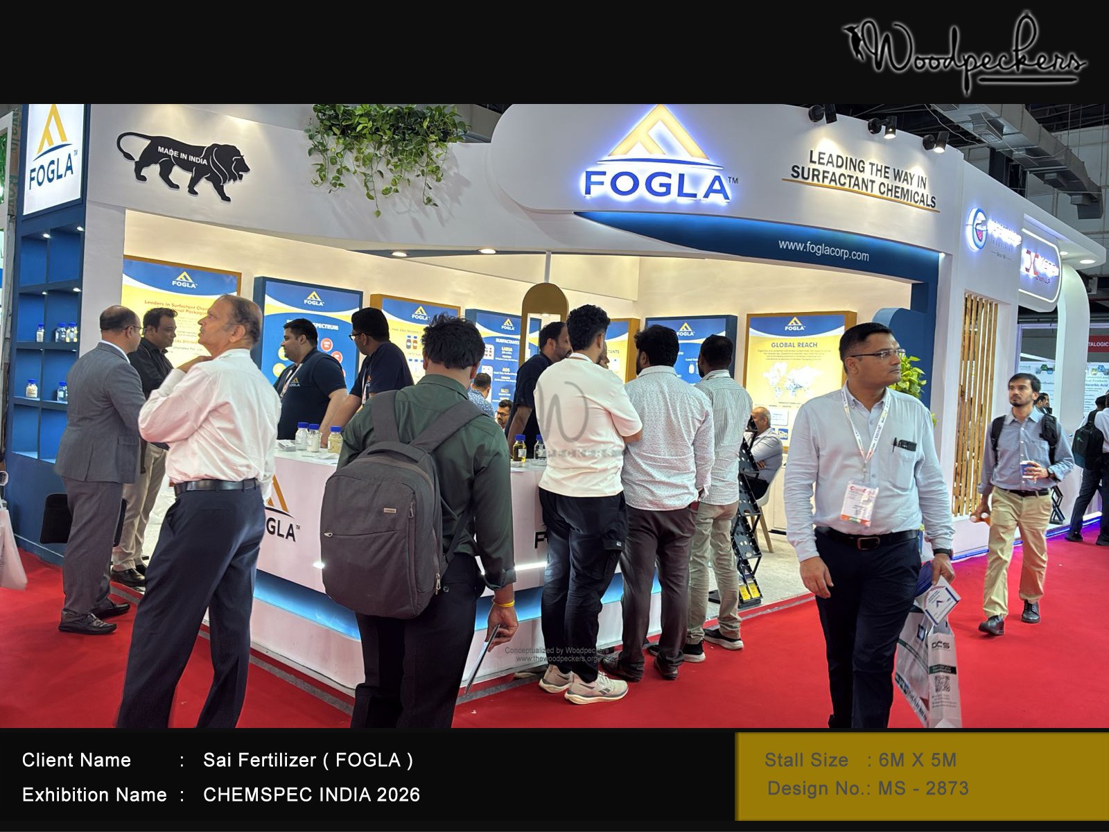
Woodpeckers Global’s portfolio includes a dedicated collection of 3-side-open exhibition stall projects, illustrating how this format can be applied in real exhibition environments.
Island vs. Peninsula Booth Options: What Is the Real Difference?
This is one of the most important decisions for large exhibitors.
Both formats deliver excellent visibility.
But their spatial personalities are very different.
Peninsula Booth
A peninsula provides:
Three open sides + one strong architectural anchor.
That rear wall makes it easier to hide storage, services and meeting areas.
Island Booth
An island provides:
Four open sides + 360-degree visibility.
There is no conventional back wall.
That fundamentally changes the exhibition stall design.
When evaluating island vs peninsula booth options, ask yourself what your brand genuinely needs more:
Maximum visibility or maximum spatial control?
If private meetings, substantial storage and large communication walls are priorities, a peninsula may be extremely efficient.
If your objective is to dominate the hall visually and attract traffic from every direction, an island can be exceptionally powerful.
Neither format is inherently superior.
The best island vs peninsula booth options depend on your exhibition goals.
Island Exhibition Stall Design: Designing Without a Back
Island stalls are exciting because visitors can approach from virtually every direction.
They are also among the hardest booths to design properly.
Why?
Because conventional booth design depends heavily on walls.
Walls carry graphics.
Walls hide storage.
Walls support screens.
Walls create meeting rooms.
Walls conceal operational clutter.
An island booth removes much of that convenience.
Great multi-sided open stall layouts therefore often move functional elements towards the centre.
Instead of creating a traditional back wall, designers can develop a central architectural core containing:
- Storage
- Pantry
- Utilities
- LED displays
- Private meeting rooms
- Structural supports
The perimeter remains open.
This creates a strong visual effect:
The booth feels accessible from every direction while its operational requirements disappear into the centre.
3 Side Open Booth Configurations vs. Island Booths
Let us imagine two 150 sq. metre booths.
One has three open sides.
The other has four.
On paper, the difference sounds minor.
Architecturally, it is significant.
With 3 side open booth configurations, the designer can concentrate utilities, storage and meeting rooms against the closed side.
With an island stall, every visible elevation needs consideration.
That can increase demands on finishing, structural detailing, branding and service concealment.
For this reason, island vs peninsula booth options should ideally be discussed before the exhibition space is finalised—not after.
Experienced exhibition stand builders can sometimes help brands evaluate potential stand locations based on visibility, footfall direction and the type of experience they intend to build.
Think About Sightlines Before You Think About Walls
One of the most useful questions in spatial planning is:
What does someone see 20 metres before reaching the booth?
Then:
What do they see at 10 metres?
And finally:
What makes them step inside?
Strong exhibition stall design works across all three distances.
From far away, visitors may notice:
- Suspended branding
- Elevated signage
- Architectural form
- Large digital screens
At mid-distance, they begin noticing:
- Products
- Demonstrations
- People
- Messaging
- Trade show displays
At close range, they need a reason to engage.
This may be a product expert, interactive experience, demonstration or clearly defined reception point.
Woodpeckers Global describes its exhibition layouts as being designed around sightlines, meeting zones, visitor flow and engagement rather than aesthetics alone.
This spatial thinking becomes especially important in multi-sided open stall layouts, where there may be several equally important sightlines.
Foot Traffic Should Shape Your Custom Booth Design
Exhibition halls are not neutral grids.
People move through them in patterns.
Visitors arrive through particular entrances.
Major brands create natural traffic magnets.
Food areas generate movement.
Conference halls release groups of attendees simultaneously.
Main aisles generally behave differently from secondary aisles.
The best custom booth design takes these realities into account.
For example, suppose most visitors approach a corner stand from the left-hand aisle.
Placing your reception desk directly across that natural approach could unintentionally create a barrier.
Rotate it slightly and suddenly the same counter becomes an invitation.
This is where woodpeckers spatial planning systems can be understood less as arranging furniture on a floor plan and more as mapping likely visitor journeys But structure does not always require walls.
After more than 22 years in exhibition design, Woodpeckers Global positions visitor flow and space utilisation as integral parts of its design process.
Create Zones Without Making the Stall Feel Boxed In
Open plans need structure.
But structure does not always require walls.
Consider dividing your exhibition stall design into experiential zones:
Attraction Zone
What catches attention?
Discovery Zone
Where does the visitor understand your products?
Engagement Zone
Where do demonstrations or interactions happen?
Conversation Zone
Where does the sales team speak to prospects?
Hospitality Zone
Where can important clients sit comfortably?
Back-of-House Zone
Where do you hide everything visitors should never see?
This zoning approach is particularly useful for 3 side open booth configurations and island stands because it creates invisible structure within visually open spaces.
Trade Show Displays Should Follow Visitor Movement
One common design mistake is choosing display locations because they look balanced on a floor plan.
A floor plan is not how visitors experience an exhibition.
They experience it while walking.
That means trade show displays should appear at moments where they naturally interrupt or reward the visitor journey.
A hero product can attract attention near an open corner.
A digital screen can sit deeper inside the stand to encourage movement.
Smaller displays can lead visitors towards technical experts.
A launch product may deserve a central presentation zone.
Instead of asking:
Where can we fit this display?”
Ask:
“At what point in the visitor journey should someone discover this product?”
That small change in thinking can dramatically improve custom booth design.
Your Booth Should Have a Visual Hierarchy
Not everything deserves equal attention.
If your logo, five products, six screens, reception desk and four marketing messages are all shouting simultaneously, visitors may remember none of them.
Strong exhibition stall design creates hierarchy.
Ideally:
One thing attracts.
One thing explains.
One thing converts.
For example:
A dramatic suspended logo attracts visitors.
A central product demonstration explains the proposition.
A strategically positioned meeting space converts interest into conversation.
This principle becomes especially important in multi-sided open stall layouts, because every direction introduces additional visual information.
More exposure should not create more clutter.
How 3D Visualisation Helps Compare Floor Plans
Before committing to fabrication, a 3D render allows decision-makers to experience the proposed booth far more intuitively than a technical floor plan alone.
Woodpeckers Global specifically lists 3D Booth Visualization as part of its exhibition stall design offering.
A useful 3D review should not focus only on colours and finishes.
Use it to ask:
- Can the logo be seen from major aisles?
- Do open sides genuinely feel open?
- Are counters obstructing entry?
- Can visitors understand the product hierarchy?
- Are meeting rooms too exposed?
- Where is storage concealed?
- How does the booth look from multiple approach angles?
- Does the stand feel crowded when people are added?
This is especially useful when comparing island vs peninsula booth options, because a render makes the difference between 270-degree and 360-degree exposure much easier to understand.
You can explore Woodpeckers Global’s Exhibition Stall Design & 3D Booth Visualization offering here.
So, Which Exhibition Stall Design Should You Choose?
There is no universally perfect footprint.
Choose a linear stall when budget efficiency, controlled messaging and functional wall space matter most.
Choose a corner stall when you want greater visibility while retaining substantial usable wall space.
Choose a peninsula stall when you want strong exposure from three directions but still require a structural backbone for branding, storage and private areas.
Choose an island stall when 360-degree presence, scale and brand impact justify the additional spatial and fabrication complexity.
The important thing is not to select a floor plan simply because it sounds more premium.
Select it because it supports the experience you want visitors to have.
22+ Years of Turning Floor Plans Into Visitor Journeys
A successful exhibition stand is not simply a collection of walls, graphics and furniture.
It is a controlled journey through a brand.
Woodpeckers Global brings more than 22 years of exhibition stall design experience to this process and highlights bespoke design, visitor flow, in-house design and fabrication, and 3D visualisation among its capabilities.
Whether the brief involves a compact corner booth, 3 side open booth configurations, complex multi-sided open stall layouts or a large island environment, spatial planning should answer one commercial question:
How do we turn people walking past the booth into people walking into it—and then into meaningful conversations?
That is ultimately what good design should do.
Planning Your Next Exhibition Stall?
Explore Woodpeckers Global’s Exhibition Stall Design services for bespoke planning, design, 3D visualisation and execution.
Browse the Woodpeckers Global Exhibition Portfolio to see completed stands and different spatial configurations.
You can also explore the dedicated 3 Side Open Exhibition Stall Design Portfolio for examples of this specific floor-plan format.
Because choosing the right footprint is not really about how many sides are open. It is about how many opportunities you create for the right visitor to step inside.