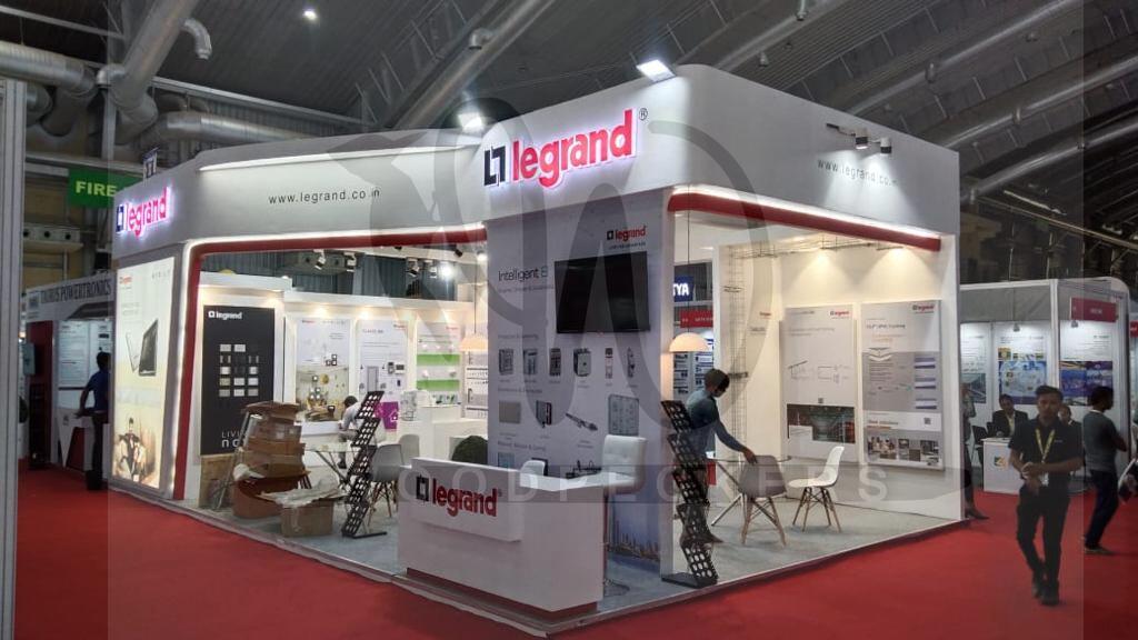
In order for your exhibition stand to grow, you need to use colours creatively. According to several studies, colour is the most important visual cue for influencing buyers and visitors. Colour plays a huge role in determining the mood and theme of any exhibition stall design. Your brand must be recognizable by the right combination of colours. The correct utilisation of colour schemes within a branding space can draw attention to important visual points, which convey the theme of your innovative exhibition stall design making it instantly recognizable.
It is important to understand how colour works in order to understand why certain stand designs are successful. You can bring this knowledge into use when planning your exhibition booth design.
- Make an impact with black
There is often a perception that black is a sophisticated colour. It is common for brands to use black to make their products appear glamorous and distinctive. The colour works well with most colours, especially white. A black exhibition stand graphic will convey authority and status if you want to convey authority and status.
- Get energized with Orange
The colour orange symbolizes passion, fun, and energy. Orange is often incorporated into the branding of children’s and teens’ brands. To instil liveliness in your attendees, you can do the same. By using an orange colour scheme in their uniforms, you can make your staff appear more friendly and approachable.
- Vitalize with Red
The psychological impact of red is well-documented. The colour red stimulates the senses. It is the easiest colour to spot, which is why traffic lights and stop signs have been painted this colour everywhere. Ensure your booth is visible across the trade fair by using red for your hanging banner.
Take a look beyond the basics
Imagine that you want to use colour in your exhibition stand design in order to make it more exciting to look at. You can’t add more colour to your brand’s colour scheme because it doesn’t leave enough room. What do you do about it? If you only have a few colour options left, how do you make sure that you get the most out of them? Pick colours that are analogous to those of your main brand. Colours that pair well together are analogous colours. For guidance, you can find a number of colour wheels online. To assist you, you can use an RBG or CMYK colour wheel. Both colour wheels are used by designers in a wide range of industries, and neither is superior to the other.
Boost your aesthetic appeal
Your brand logo’s colour cannot be changed much. Your exhibition stand graphics can play off the other colours surrounding your logo. It will be easier to make your logo stand out and look three-dimensional if it is surrounded by colours such as red or yellow. Exhibit stand walls aren’t the only place where complementary colours can be used. Your stand accessories, equipment, and staff uniforms can be designed in those colours. The use of multiple colours should be avoided, however.
Beyond the walls, banners, and exhibition stand graphics, you should also consider the flooring, counters, uniforms and giveaway items of the exhibition stall design and fabrication. Colour-coordinated uniforms can make you stand out in a memorable and attractive way at exhibitions, as we briefly mentioned.
Besides promoting your brand, your staff can also be recognisable to attendees. Colour can also be used to enhance the flooring of your stand. We hope that the points we’ve covered have built your understanding of how colour can make a huge difference in the perception of trade show booth design.
When exhibition stands are being spoken of, it is difficult not to mention the best exhibition stall designer in India – Woodpeckers Global. Phenomenal services at the hands of skilled professionals; visit https://woodpeckersglobal.com/ today!


